Democratic Decline
Democracy
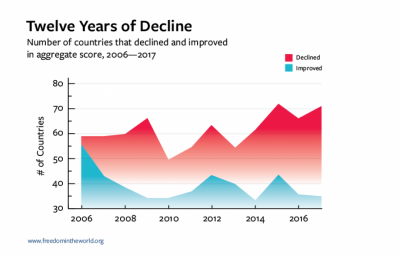
After much improvement, a global democratic decline began in 2006:
(MJ disclaimer: bogus graph. Graphs should start with 0 on the Y axis to get an accurate picture of absolute numbers)
(EL Note, Check out Spurious Correlations for some examples of PROPER graphs, although the true mark of a expert statistician is to have the Y axis be "things being good or bad" have the x be time (with gaps between years obviously), and BAM your political point is proven beyond a reasonable doubt)
This was marked when the number of countries that worsened in their democracy - overtaking the number of countries that improved. About 60 declined, and 55 improved. And that was just the beginning. By 2017, 70 countries declined that year, and only 35 improved. Think about that! Granted, this graph does not really say what the decline or improvement was, so an avid student should find out more about the actual changes to make a more informed conclusion.
And then https://freedomhouse.org/report/freedom-world/2018/democracy-crisis
Interesting. That's the year MJ and his partner started Factor e Farm.
Internet Freedom
Democracy Indexes
- There are various ones out there, but they paint a good picture (quite literally via some of the maps made) of how things stand, and on a more optimistic note what can be improved
- The Wikipedia Page on Democracy Indices
