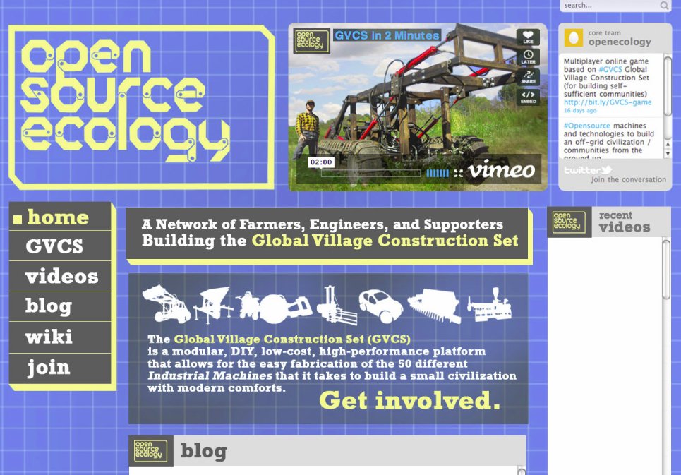
GVCS Website Mockup
(See source at http://www.encyclopediapictura.com/ose_design.jpg)
Explanation:
Website Title: OPEN SOURCE ECOLOGY
Pages:
HOME
- Frontpage blurb.
- Embedded Vimeo headline video
- Embedded Blog Feed
- Embedded Recent Videos Feed
- Embedded Twitter Feed
GVCS
This is the page that sells people on what we are doing. It includes lots of text and graphics that explain the key features of the GVCS concept, and an outline of the entire GVCS product ecology (how the 50 Machines relate).
VIDEOS
Embed Videos Feed
BLOG
Embed Blog
WIKI
1.Embed or rebuild the OSE Wiki, which consists primarily of a page for every machine (50), with links to their respective Development page, Instructional page, and User Manual page. Also on each machine's wiki page, will be a product icon, status headline, problem statement, conceptual diagram, product ecology map, demo video, cost/efficiency data visualization (if applicable), demo photos, design rational, status chart.
Note:
Perhaps technical development can happen through the wiki too. This includes sharing design files, posting calendars, links to google docs... Then in bettermeans we vote on decisions about work items and track their progress. Another possibility is to use some other platform altogether, what do you think of open atrium? Could this be the right tool for us or do you think the wiki will do?
At the very least, we just need you to get the Wiki functional in the new site, and we can do the rest.
JOIN
Ways to Join:
- A list of opportunities for Technical Contributors
- Describing opportunities for replicating the machines either for use or sale.
- An appeal for crowd-funding subscription support through our True Fans program.
- An appeal to Angel Investors for non-profit donations.
ABOUT
- Several Paragraphs about our mission as an organization
- Profiles of important contributors
- Paragraph that links to the True Fans Wiki Page
- Paragraph that links to the Join Page
Comment from Judith
Here are my comments on the mock up. Keep in mind I am coming at this from a nonprofit organization development standpoint.
Things I like:
   * What it says in the two boxes at the center of the page. That helps me to get the GVCS right away.
   * The navigation - it seems orderly and easy
   * The social media links - to spread the meme
   * The blue background motif
Things I would like to see:
   * An email signup to capture people who are interested
   * A big "donate" button for people ready to give
   * A third-party testimonial endorsement
   * A link to to information that shows where donations go
I feel refreshed and enlivened watching the collaboration on this project grow. Thanks.
From Marcin
- Testimonial - Your project is amazing. Thrilling, actually...It's people like you who really give me hope for the future. - Chris Anderson, TED Curator, 4/12/11
