War Statistics
Historical Trend
The absolute number of war deaths has a significant rise since 1400 (see data section), with the caveat that there is 15x more people today than in 1400. (what is the "per person" death rate, ie total deaths / world population)
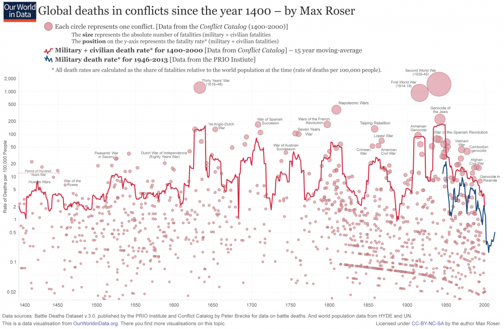
The war death rate up to 2016 is comparable to 1400, and higher than immediately after WW2:
Data
https://ourworldindata.org/war-and-peace
Here is a graph of war deaths over 600 years:
https://www.vox.com/2015/6/23/8832311/war-casualties-600-years
The death rate remains at about 10,000 per year, same as 600 years ago. The graph is actually quite misleading. It makes it look like a collapse to zero up to 2000. If you look at more current data from the first link ([1]), you see that is not the case at all. The 600 years shows a bunch of smaller conflicts with decreasing fatalities, and downward trends. Don't be fooled. The most important feature of the graph is the solid red line: total death rate. Note that the population in 1400 was 15x lower (see World Population), so the number of deaths is increasing continuously.
The downturn is likely due to:
- Precision Bombing replacing carpet bombing in most cases
- MAD making large scale superpower wars unlikely
- Mechanized (and robotic in some cases) warfare reducing the human factor
- Medical technology (a soldier not being able to fight, vs being alive is different)
One intresting side affect may be the disparity between the technologically advanced superpower having little to no deaths due to robotic weaponry vs the other group who may not have that technology. Could also make war less of a political/emotional risk due to less people dying, and thus easier for superpowers to do
Groups like NATO, the EU, UN, and various other groups (carribean has some sort of EU like thing) also make war less likely (due to being interconnected), and less needed (proper diplomatic channels) so that may also be contributing to the downturn
