Per Capita Income: Difference between revisions
Jump to navigation
Jump to search
No edit summary |
|||
| (4 intermediate revisions by the same user not shown) | |||
| Line 4: | Line 4: | ||
=American Pie Chart= | =American Pie Chart= | ||
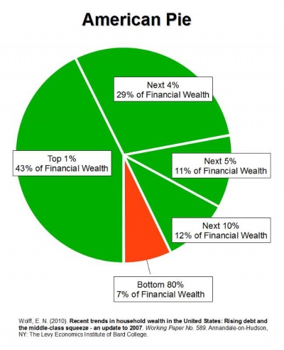
Top 1% have 43% of the wealth, and bottom 80% have 7% of the wealth in 2010. Gee, is there something wrong with this picture? | Top 1% in the USA have 43% of the wealth, and bottom 80% have 7% of the wealth in 2010. Source: [http://currydemocrats.org/in_perspective/american_pie_save_130529.html]. Gee, is there something wrong with this picture? | ||
[[File:americanpie.jpg|400px]] | [[File:americanpie.jpg|400px]] | ||
=Is Taxation Fair based on Income Bracket?= | |||
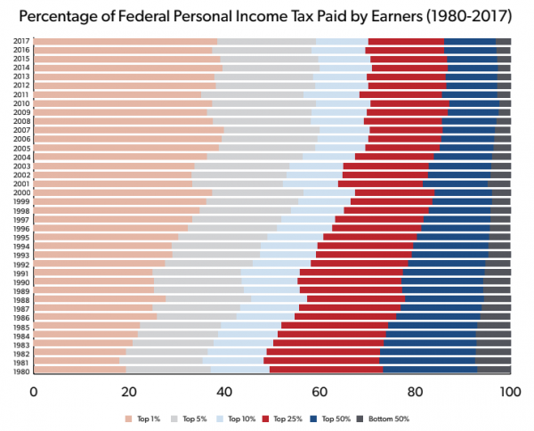
If we believe the above graph and the graph below [https://www.ntu.org/foundation/tax-page/who-pays-income-taxes] - | |||
[[File:taxbybracket.png|600px]] | |||
Then the conclusion is: | |||
'''Taxation in the USA indeed appears to be quite fair for personal income tax - because the top 1% have about 40% of the wealth, and they pay about 40% of the total income taxes.''' | |||
Is that a fair assessment? | |||
Latest revision as of 19:08, 1 July 2020
Definitions
- It includes every man, woman, and child. [1]
- Purportedly $64k in the USA [2]. This is highly misleading, as this is skewed significantly towards the upper range, as $64k for every man, woman, and child would mean everyone is living like a king
American Pie Chart
Top 1% in the USA have 43% of the wealth, and bottom 80% have 7% of the wealth in 2010. Source: [3]. Gee, is there something wrong with this picture?
Is Taxation Fair based on Income Bracket?
If we believe the above graph and the graph below [4] -
Then the conclusion is:
Taxation in the USA indeed appears to be quite fair for personal income tax - because the top 1% have about 40% of the wealth, and they pay about 40% of the total income taxes.
Is that a fair assessment?

