War Statistics
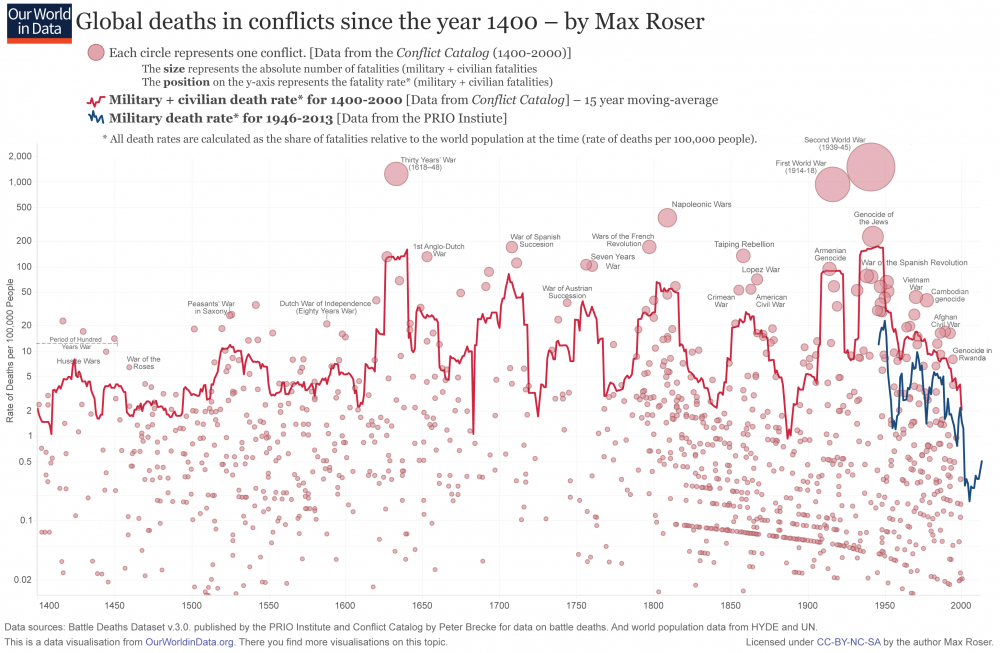
=Historical Trend The absolute number of war deaths has a significant rise since 1400 (see data section), with the caveat that there is 15x more people today than in 1400.
The war death rate up to 2016 is comparable to 1400.
Data
https://ourworldindata.org/war-and-peace
Here is a graph of war deaths over 600 years:
https://www.vox.com/2015/6/23/8832311/war-casualties-600-years
The death rate remains at about 10,000 per year, same as 600 years ago. The graph is actually quite misleading. It makes it look like a collapse to zero up to 2000. If you look at more current data from the first link ([1]), you see that is not the case at all. The 600 years shows a bunch of smaller conflicts with decreasing fatalities, and downward trends. Don't be fooled. The most important feature of the graph is the solid red line: total death rate. Note that the population in 1400 was 15x lower (see World Population), so the number of deaths is increasing continuously.
