War Statistics
Jump to navigation
Jump to search
https://ourworldindata.org/war-and-peace
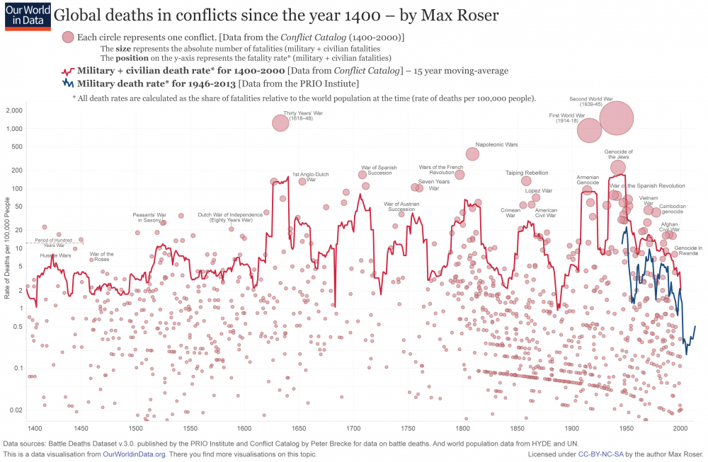
Here is a graph of war deaths over 600 years:
https://www.vox.com/2015/6/23/8832311/war-casualties-600-years
The death rate remains at about 10,000 per year, same as 600 years ago. The graph is actually quite misleading. It makes it look like a collapse to zero up to 2000. If you look at more current data from the first link ([1]), you see that is not the case at all. The 600 years shows a bunch of smaller conflicts with decreasing fatalities, and downward trends. Don't be fooled. The most important feature of the graph is the solid red line: total death rate. Note that the population in 1400 was 15x lower (see World Population), so the number of deaths is increasing continuously.
